Page Content
Color coding is possible as long as the color information is supplemented
with differences in shape or text. Here are some accessible and inaccessible
examples.
WCAG 2.2 Guidlines on Color Coding
If you plan to use color coding to convey content, you should ensure that there is a second mechanism (e.g. different shapes or text labels) to provide the information to audiences who cannot perceive the color changing including the blind and color deficient users.
WCAG Guideline 1.4.1–"Use of Color: Color is not used as the only visual means of conveying information, indicating an action, prompting a response, or distinguishing a visual element. (Level A)"
Coding Right/Wrong (Red/Green)
A particularly problematic case is red vs green color coding because that is the most common form of color deficient vision. Below are some examples of how to incorporate color coding in an accessible manner.
Inaccessible Red/Green Encoding
| Bx | Do’s and Dont’s |
|---|---|
| Check site with color checkers or grayscale monitor | |
| Use color coding alone | |
| Use blue/green or black/white/gray | |
| Use red/green |
A colorblind user could have trouble distinguishing a green box from a red
box. Furthermore, a colored cell would be inaccessible to screen readers unless
invisible text was included.
Note: An ALT Text was added for screen reader use.
More Accessible Alternatives
The following examples provide examples of how shape or text labels supplement the color coding.
Accessible Color Coding with Shape
| Symbol | Do’s and Dont’s |
|---|---|
| + | Check site with color checkers or grayscale monitor |
| x | Use color coding alone |
| + | Pay attention to contrast in lightness/darkness |
| x | Use red/green along |
Color deficient users can rely on cues of shape in the “+” and “x” symbols to
distinguish “dos” and “don’ts”. Using text symbols with a key is also more
accessible to screen reader users than color-coding alone.
Accessible Color-Coding with Text
| Symbol | Do’s and Dont’s | Do | Check site with color checkers or grayscale monitor |
|---|---|
| Don’t | Use color coding alone |
| Do | Pay attention to contrast in lightness/darkness |
| Don’t | Use red/green alone |
This table is color-coded, but the text labels makes it accessible to colorblind users and those using
screen readers.
Use Red and Blue
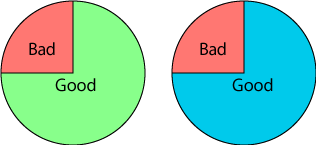
Developers using red and green to encode "right" and "wrong" may want to consider replacing green with a shade of blue. A higher percentage of viewers can detect a distinction between red and blue then red and green.
See examples below:
Normal Color View

Note: It’s still important to supplement color with additional cues. Here text labels indicate bad vs. good proportions of the pie chart.
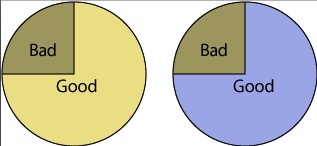
Red-Green Vision Loss
This is the same image viewed in the Deuteroanomaly filter in Photoshop. The blue hue is preserved, but the green becomes a shade of yellow.

Last Update: February 5, 2025

