Although the WCAG 2.1 Guidelines do not provide specific guidelines for many elements of typography, that does not mean some options won’t cause legibility issues.
Defining Light Weight Fonts
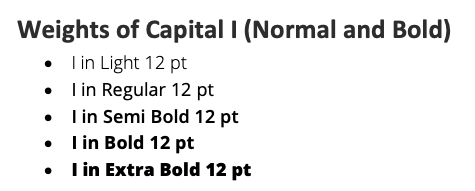
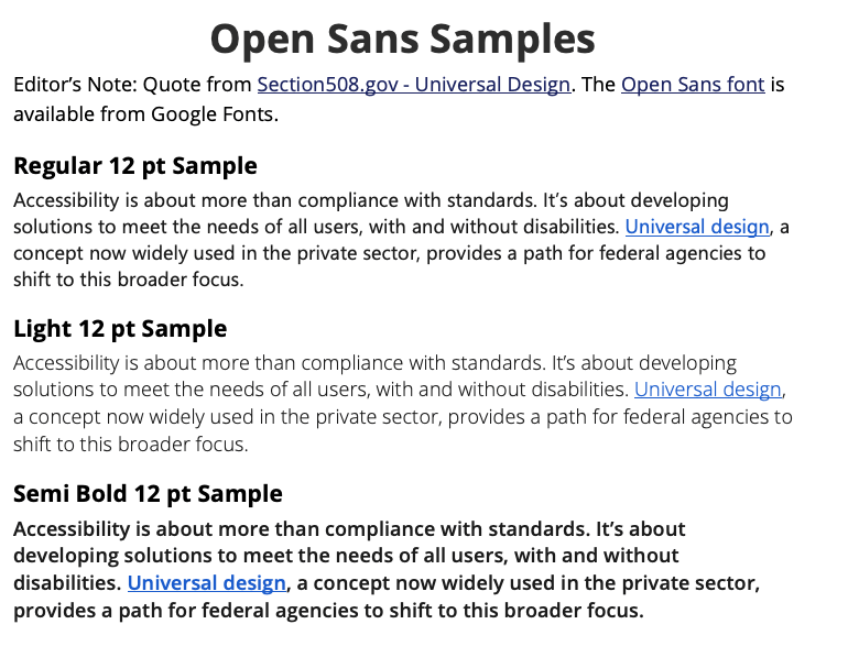
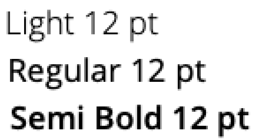
The weight of a font refers to the width of the stroke within a character. The thinner the stroke, the lighter the font. The weight of a font is probably most easily seen in sans-serif fonts like Arial, Helvetica, Google Open Sans and others.
Most fonts come with a Normal/Regular face, and a heavier Bold face.
Weights of Capital I (Normal and Bold)
- I in Sans Serif Normal – Medium Weight
- I in Sans Serif Bold – Heavier
But some fonts such as Google Open Sans come with options for four or more weights ranging the very thin "light" to the very heavy "extra-bold/black."

Problems with Light Fonts in Body Text
As with cursive, extra bold, condensed and script fonts, light fonts may be best suited for headlines or short passages. When a light weight font is used for long passages in body text, the lightness of the characters may be difficult for many readers to clearly see because the ultra thin strokes can cause the letters to blend in with the background (Mandy Michael 2019).

Even when text is a "vector graphic", a computer monitor is still pixelating text through a rasterization process. With any font, even when it is specified as being black, the outline is usually made up of various shades of gray blocks which help form the illusion of a smooth curve. However, when the font is light-weight, the lighter "outline" can eliminate large portions of the original color. What was specified as black text has large sections of gray which would only be usable in a large text format at 18 points or above.

If a light weight font is set to dark gray on white, the rasterization causes some portions to become a light gray which fails contrast guidelines completely. At larger sizes, the stroke is actually a little thicker, so the effects of rasterization are not as detrimental. This makes light weight fonts a good way to make blocks of large size font text less dominant, tone down bright colors in a headline, or save ink.
References
Michael, Mandy (2019) Things to consider when creating Accessible Text
https://medium.com/@mandy.michael/creating-accessible-text-60a91e9d1d3c
Accessed October 4, 2021.
Nordell, Jennifer (2016) Re: What does font weight mean exactly? [Discussion Post]
https://teamtreehouse.com/community/what-does-font-weight-mean-exactly
Accessed October 4, 2021.
Weprin, Matthew (2016) Lights Fonts: Good or Bad for the User
https://uxdict.io/lights-fonts-good-or-bad-for-the-user-931088d2be86
Accessed October 4, 2021.
Wikipedia. (n.d.) Rasterisation.
https://en.wikipedia.org/wiki/Rasterisation
Accessed October 4, 2021.

