Page Content
This page includes information about using CSS (Cascading Style Sheets) for accessibility. See the list of CSS tutorials under "External Links" if you are interested in learning more about style sheets.
This site also includes a page on CSS rollovers.
Synopsis
- The use of style sheets to provide formatting has several accessibilityadvantages, including the following:
- You can use CSS to improve legibility by increasing line spacing, increasing left and right margins and specifying fonts designed for a monitor. See some code examples below
- You can replace less accessible image links and JavaScript rollovers with text links styled with CSS. Text links are more accessible because they do not "pixelate" when text is zoomed.
- Users with colorblindness or in low visibility conditions can implement custom style sheets to enhance contrast and legibility.
- In some cases, the use of style sheets to specify background colors and borders can improve the accessibility of layouts and decrease reliance on HTML tables for layouts.
- It is easier to re-design content for alternate media such as printing and mobile technology (e.g. smart phones and Palm pilots) via alternate style sheets.
- However, care must be taken that Web sites are still readable on visual browsers with style sheets turned off. See the section "When Styling is Inaccessible" for details on what to avoid.
WCAG 2.0 Guideline 1.3.1—"Information, structure, and relationships conveyed through presentation can be programmatically determined or are available in text."
NOTE: The iCita Firefox Accessibility Toolbar will allow you to display your Web page without CSS markup. - CSS commands for specifying absolute font sizes should be avoided. Use relative font sizes instead.
- Remember that any tag can be styled. This includes accessibility tags such as TH, CAPTION, STRONG, FIELDSET, LABEL, OPTION and SELECT.
- Avoid using
float:right, since it typically requires coders to place elements that will be displayed on the right BEFORE those on the left. Screen readers will read files in code order, not in layout order. A layout table may sometimes be more accessible than complicated CSS layouts. - If you use absolute positioning, be sure that the positioned text is in logical order, so that it will be coherent with CSS disabled.
- Do not use
visibility: hiddento hide text from visual browsers; it also hides it from screen readers. See the Skip Nav page for accessible methods for hiding text for details. - Style sheet commands should be stored in a separate .css text file, not embedded in the HTML document itself. This allows users to completely override your style sheet.
Some Benefits of Style Sheets
Style sheets are designed to allow you to globally specify colors, fonts and backgrounds for an entire Web site. For instance, if you specify that all H1 tags should be centered, then you do not need to repeat the ALIGN="center" tag on every page.
Here are some examples of how style sheets can improve accessibility and reduce code maintenance.
Line Spacing and Margins
The generic specifications for margin and line spacing are not optimized for screen legibility. Compare the following two paragraphs – one with legibility-enhancing styles and one with no styling.
With CSS
Increased side margins, Verdana specified and line spacing increased slightly.
SAMPLE PARAGRAPH: Style sheets are designed to allow you to globally specify colors, fonts and backgrounds for an entire Web site. For instance, if you specify that all H1 tags should be centered, then you do not need to repeat the ALIGN="center" tag on every page.
View the Code
body {

margin-left: 25px; margin-right: 25px;

font-family: Verdana,Arial,Helvetica,sans-serif;

line-spacing: 120%}
Without CSS
Text goes to edge of screen, is single-spaced and in Times New Roman (not ideal for monitors).
SAMPLE PARAGRAPH: Style sheets are designed to allow you to globally specify colors, fonts and backgrounds for an entire Web site. For instance, if you specify that all H1 tags should be centered, then you do not need to repeat the ALIGN="center" tag on every page.
Coloring and Aligning H Tags
Sample H1 – Centered and colored blue
With CSS
h1 {color: #000066; text-align: center;}

...

<h1 > Sample H1 </h1>
Without CSS
<h1 align="center"> <font color="#336699> Sample H1 </font> </h1>
Creating Formatting DIVs Resembling Tables
This is a centered pink div with dotted black border. Actually it’s a P with a style specification.
With CSS
.pinkdiv {border: 1px dotted black;

background-color: #FFAADD;

padding: 7px;

margin-left: 150px; margin-right: 150px;}

...

<p class="pinkdiv" > I want a centered pink div area </p >
Without CSS
Displaying colored or dotted borders is extremely difficult without CSS, and would probably require nested tables. See the code below for a pink table with a solid black border.
 <table align="center" width="60%" cellpadding="7" border = "1">

<tr>

<td bgcolor="FFAADD"> I want a pink table </td>


 </tr>


</table>
NOTE: Data tables are still the best option for presenting tabular data.
When Styling is Inaccessible
CSS can cause accessibility problems if not thoughtfully executed. Below are some examples.
Float: Right and Absolute Positioning
Some sites use different "floats" to position content without tables. However, some style attributes, such as float: right cause text to be placed in an order different from that of the HTML file. For instance, the following site uses float: right to position the gray box to the right of a list of links. See the page on CSS: Ensuring that Text Order is Logical for details.
Non-Contrastive Backgrounds
Whatever theme or color scheme is used, it should have sufficient contrast between text and background. In many modern sites, the contrast is too muted to meet WCAG AA standards.
Mixing Styles with Old Formatting Tags
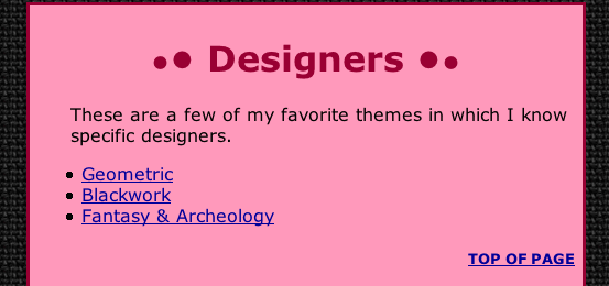
This Web site has a black linen background with a pale rose area in the center with dark text. The color contrast is sufficent.
Stitching site with black background and pink text area
The designer used CSS for the pink area and an HTML tag to specify the black linen background as <body background="blacklinen.gif">.

Styling Turned Off – Inaccessible
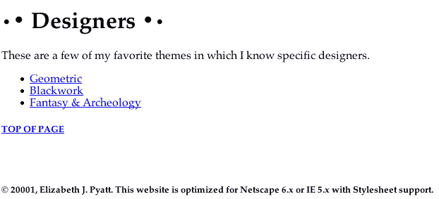
Because only the rose text was formatted with CSS, when the style sheet was turned off, the result was black text and blue links on a black textured background – clearly unreadable in a visual browser.

Styling Turned Off – Accessible
Once the site was redesigned so that the background image was included in the CSS file and not in the HTML, the site without CSS was readable, although it appears with standard white background with black text.

Notice that the use of H tags to provide content structure means that sections are easier to distinguish even with style sheets turned off.

