Page Content
Whenever a document is organized so that information is in multiple columns or multiple text areas (e.g. text captions, unusual placement of icons/text), then it is important to verify that the screen reader reads the information in a logical or coherent order.
WCAG 2.0 Guideline 1.3.1—"Information, structure, and relationships conveyed through presentation can be programmatically determined or are available in text."
For Web pages, an important principle to remember is that screen readers read pages in HTML code order. However, the improper use of CSS and table layout could cause the visual order to be different from code order.
The information below will provide some potential roadblocks CSS stylesheets can present and suggestions for how to avoid them.
Synopsis
-
Avoid using float:right, since it typically requires coders to place elements that will be displayed on the right BEFORE those on the left. Screen
readers will read files in code order, not in layout order. A layout table may sometimes be more accessible than complicated CSS layouts. -
If you use absolute positioning, be sure that the positioned text is in logical order within the HTML code, so that the text will be coherent with CSS disabled.
-
Do not use "visibility: hidden" to hide text from visual browsers; it also hides it from screen readers. See the Skip Nav page for accessible methods for hiding text for details.
Dangers of float:right
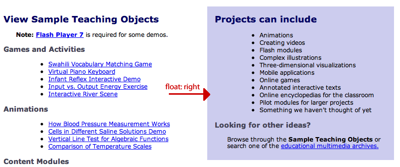
The float:right specification is used to place items to the right side of the page. However, the text floated to the right is often placed BEFORE other text to its left in the HTML. Thus the visual order may be left to right (with the floated item second) while the HTML item will read the floated item first.
See the example below which compares the position of elements with CSS enabled, then disabled.
Page with Float:Right Positioning

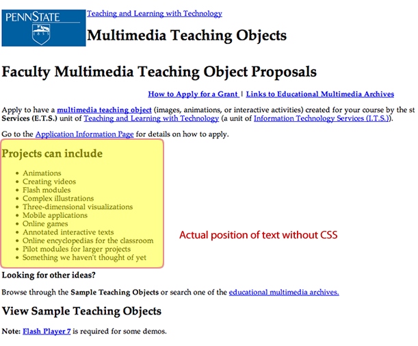
But in the code, the list of example projects in the right hand box actually comes first. When CSS is disabled, you can see the list above the section with the links. Fortuniately, the text can be read in either order.
View the float:right Code
CSS
.projectbox {

    float:right;

    width:45%;

    background-color:#CCF;

    color: black;

    padding:7px;

    margin: 5px;

}
HTML
<body>

<div class="projectbox">

<h2>Projects can Include</h2>

[ORDERED LIST]

</div>

<h2>View Sample Teaching Objects</h2>

[TEXT]

...
Page with CSS Disabled. “Right” is on Top

Use float:left
A safer float to use is float:left because it moves content to the left (1st in visual order) while generally being in the correct position in the HTML. Note that even large content chunks (e.g. a 75% wide DIV) can be floated to the left.
When float:right is OK
The float:right attribute can be used so long as the text is still coherent in HTML order. An example is the positioning of a decorative image to the right or to the left.
Dangers of CSS Position Attribute
The position attribute is used to change the visual position of an element regardless of where it is in the code. For example any item with position:absolute and position set to top:0px and left:0px will be displayed first visually, even if the div is the final text in the HTML code. Alternatively, an item may be listed first in the code, but actually be positioned to the bottom right side of the page visually.
This can be a problem for screen reader accessibility because content can be read out of context and therefore be confusing. An example that sighted users might appreciate can be seen in the link below. It is currently in its actual code position, but once you hover or tab into it, it will be shifted 5em units up.
Surprise Web Developer Guide (Shifts 5em Up)
View the Code
CSS Styles
a.abs {[FORMATTING NOT INDICATED]}

a.abs:hover, a,abs:focus {

position:relative;

top:-5em:}
Lightbox Positioning
Another way that absolute or fixed positioning is used is to display "lightboxes" or pieces of text superimposed on a grayed out Web site (such as in warnings or pop-ups). When the lightbox text is in an incorrectly placed DIV, a screenreader will skip over the lightbox and may read the text BENEATH the lightbox instead. An additional problem is that the close button on a lightbox could be inaccessible on a keybooard.
If you wish to use a lightbox, but cannot place the lightbox text in context, consider a Javascript popup window instead. A correctly coded pop-up window can be recognized by modern screen readers and can be closed.
When position:absolute is OK
If this technique is needed, then the DIV should be inserted within the code where reading it within a screenreader will be logical. That is a DIV placed at the top via absolute positioning should have the code be near the beginning of the page.

