

Page Content
For software documentation, it is often desirable to incorporate screen captures of particular windows or menus, and images could include lots of interface elements.
The key to accessibility is to ensure that the relevant information in the screencapture is included in the text instructions. Note that text plus images can provide an accessible alternative to a video screencast.
See examples below
Avoid Incomplete Information
Below is an example of what to avoid.
Create Accessible Data Table in Dreamweaver
Use the settings below to create an accessible table.
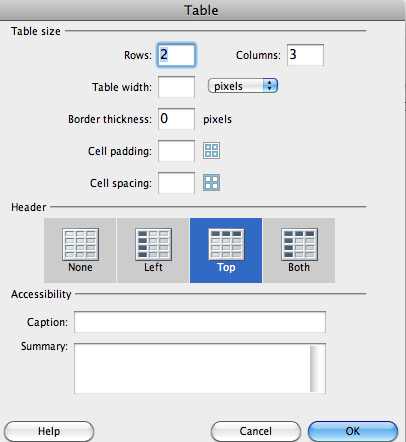
ALT Tag
ALT = "Dreamweaver Tables Properties window"
Include Relevant Information in Text
Here is the Dreamweaver information with more details in the text which provide a detailed explanation for all developers.
Create Accessible Data Table in Dreamweaver
- In Dreamweaver, go to the Insert menu then Table. A pop-up window opens.
- Fill in desired settings for rows, columns, width, border thickness, cell padding and cell spacing.
- For the Header options, select from Left, Top, Both
Note: Top or Both is the most widely supported in screenreaders. - Enter in text for Caption and Summary as needed.
Note: Caption is visible by default to all users, while Summary is used to provide extra information for those on screenreaders. - Click OK to create the table
ALT Tag
ALT = "Dreamweaver Tables Properties window. See information above"
Note that it is short because the additional information is included in the instructions above the image.
Accessible Colors in Annotations
It’s quite common to add colored arrows, ovals, labels and other elements in screen capture graphics. This can be helpful for many users, but the colors should have sufficient contrast and use accessible color coding that works in gray scale. See some examples below.
Light Mode
Highlights, ovals, arrows and text should be dark enough to pass contrast guidelines. The image below uses an 80% red (#CC0000) to provide contrast with the light gray or white.
Note: The colors orange or cyan plus white rarely pass contrast tests. They must be quite dark for that to happen.

Dark Mode
When dark mode graphics (dark backgrounds with light text) are used, the highlighting elements should be very light. Here a pale orange is used for the arrows, oval and text labels.

Last Update: February 6, 2025