Page Content

One of the most important issues for screen reader accessibility is to ensure that the multiple boxes in a PowerPoint Slide are read in the correct order. Unfortunately, it is one of the most confusing things to check for PowerPoint editors.

This blog entry will show some of the available tools and explain their pros and cons. Is there are perfect tool? Judge for yourself.

Importance of Reading Order

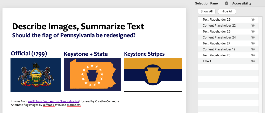
When creating a slide with a complex layout, it is important to ensure that the objects (textboxes, image Alt text and table text) are read in a coherent order in a screen reader. Consider the slide below showing three alternate designs for the Pennsylvania state flag

Slide titled Should the flag of Pennsylvania be redesigned? The current flag and two aklternates are shown. See additional details in the text below.
Thanks to Vexillokogy Wiki for providing the base images. Licensed by Creative Commons.


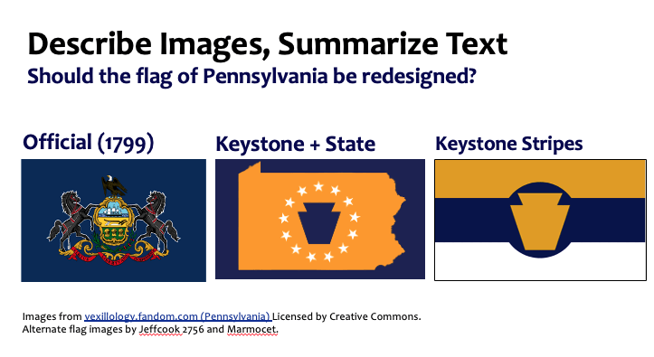
The designs are laid out horizontally with a label above each image. If a typical left to right top to bottom reading order were assumed, the reading order would be incorrect. Instead, the order must be top to bottom, left to right. See examples below:

Reading Order Alternates

Inaccessible Left to Right, Top to Bottom

  1. Official (1799)
  2. Keystone + State
  3. Keystone Stripes
  4. ALT=Current Pennsylvania flag showing two black horses propping up a shield with a tall ship on top and a field at the bottom. An eagle is sitting on top.
  5. ALT=Alternate design with yellow state shape on a dark navy background and a dark blue keystone shape surrounded by white stars.
  6. ALT=A flag with a yellow keystone shape in dark blue circle. The flag is split into three horizontal stripes – yellow, dark blue and white.


Correct Top to Bottom, Left to Right,

  1. Official (1799)
  2. ALT=Current Pennsylvania flag showing two black horses propping up a shield with a tall ship on top and a field at the bottom. An eagle is sitting on top.
  3. Keystone + State
  4. ALT=Alternate design with yellow state shape on a dark navy background and a dark blue keystone shape surrounded by white stars.
  5. Keystone Stripes
  6. ALT=A flag with a yellow keystone shape in dark blue circle. The flag is split into three horizontal stripes – yellow, dark blue and white.


Orientation Based on Title

Whichever tool you’re using, it is important to orient yourself based on the location of the title in the list of objects. This determines whether the list is read bottom to top or top to bottom.

  • When the title is on the bottom (most tools), the list is read bottom to top.
  • When the title is on the top, the list is read top to bottom.

The bottom to top reading is based on the origin of the ordering tool as a method of arranging layers of objects. Normally the title, which is read first, is placed in the bottom layer.

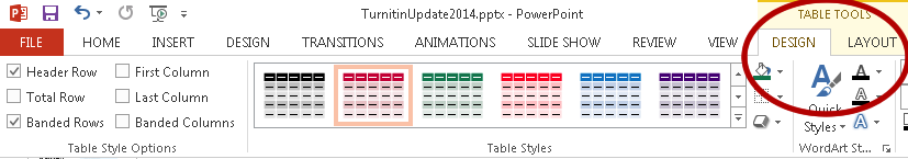
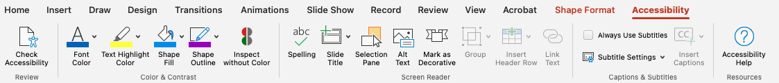
Selection Pane (Accessibility Tab)

The first tool we’re reviewing is the Selection Pane. It has the advantage of being available in every recent version of PowerPoint – both online and the desktop. It also has the same interface in all platforms, but it is a bottom-to-top tool.

How it Works

The tool is housed within the Accessibility Tab (which is only visble after the Check Accessibility report is run). Once selected, the tool opens the pane on the right slide of a slide and shows all the objects within a slide with the Title 1 object at the bottom.

Other items typically include Content Placeholders and various shapes. Note that items not in a Content Placeholder may be skipped over in some screen readers. That’s not an issue if they are decorative, but problematic if they contain critical content.

Activate Selection Pane

  1. Open a new or existing PowerPoint file.
  2. Select the Review tab.
  3. Select the Check Accessibility icon. A report opens in the right, and the Accessibility tab appears.
    Review tab with Check Accessibility icon circled.
    Accessibility tab.
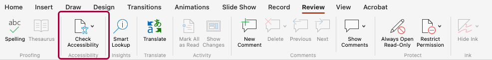
    The Check Accessibility tool in the Review tab activates the Accessibility tab.
  4. Select the Accessibility tab to use the tools, then Selection Pane. The list of objects opens on the right.
  5. Click each object in the list in the right to see which object is highlighted in the slide body.

OR

  1. In the Home tab, select Arrange then Selection Pane. The list of objects opens on the right.
  2. Click each object in the list in the right to see which object is highlighted in the slide body.
Selection Pane view with Title 1 at the bottom, with Text Placeholder 25 above, then Content Placeholder 12 and ending with Text Placeholder 29 for the copyright notice on top.
The Selection Pane for the Pennsylvania flag slide. Note the Title at the bottom.

Advantages and Disadvantages

Advantages

  • Available on all platforms
  • Same interface
  • All objects listed

Disadvantages

  • Bottom to Top order
  • Lists items by object type and number
  • Must activate Accessibility Tab

Outline Order

The Outline Order tool generates an ordered list of objects based on the order of content placeholders within a particular Layout.

How it Works

The Outline View shows the title and any text within a Placeholder within a slide – as a bonusany text can also be edited within the Outline View. More importantly, only text inserted within a Placeholder from a Master Slide Layout is shown – If text was placed within an inserted textbox, it will not appear in the Outline .

Activate Outline View

  1. Open a new or existing PowerPoint file.
  2. Select the View tab, then select Outline. The Outline view opens on the left.
  3. To return to the typical editing view, open the View tab and select Normal.
Outline View of Pennsylvania flag slide with the title on top, three text labels (items 1-3) and the copyright notice on the bottom (#4).
The Outline View for the Pennsylvania flag slide. Note the Title at the top and the numbered text objects. Non-text objects are not shown.

Advantages and Disadvantages

Advantages

  • Top to bottom order
  • Text is visible in Outline View and can be edited
  • Same interface on Mac and Windows
  • Text in Outline View guaranteed to be read out in screen reader.
  • This view distinguishes text boxes from a layout from other types of text.
  • Easy to copy and paste content from PowerPoint to Word.

Disadvantages

  • Only text objects are shown
  • Not in the online version of PowerPoint
  • Order cannot be changed here – only verified
  • Does not reflect ordering adjustments made in Selection Pane.

Windows Arrange/Reading Order Tool

In addition to the Selection Pane, some versions of Word for Windows include a separate Arrange/Reading Order tool. Below are two links documenting this tool.

Note that the University of Arkansas screen capture shows a top to bottom order, but the Microsoft documentation was showing bottom to top.

Which order is correct – check the location of the Title to be sure.

Mac Arrange Tool

How it Works

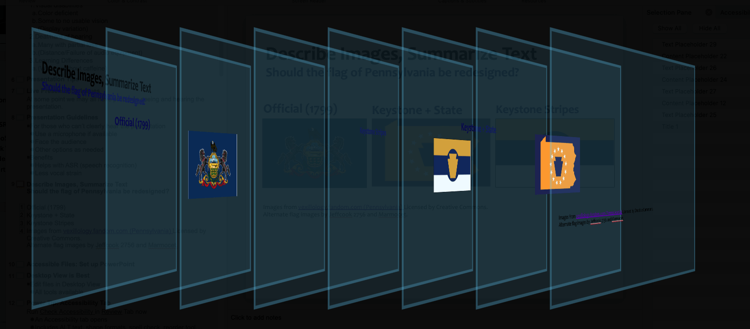
The Mac version of the Arrange tool displays the objects as a set of transparent layers. This is a bottom to top view meaning that items on the left/bottom are read first.

Activate Mac Arrange Tool

  1. On the Home tab, select the icon for Arrange : Reorder Objects. The graphical display takes over the screen.
  2. Use the mouse to move layers to the desired order, then click OK to exit the tool.
A display showing objects as being embedded in transparent layers with the bottom at the left
The Mac Arrange view for the Pennsylvania flag slide.

Advantages and Disadvantages

Advantages

  • All objects are shown.

Disadvantages

  • Bottom to top order. Object #1 is to the right in the "top" layer, but read last.
  • The visual is complex and may not have good contrast.

Top of Page

Last Update: April 3, 2024

Word Accessibility Tips

This blog article is part a series of blog posts which will explain how different tools in Word can be used to both enhance the accessibility of a document and allow editors to create more consistently formatted documents.

In this blog post, we’ll cover some aspects of modifying default table styles within Microsoft Word. Although table formats rely on styles, they are accessed through the table design tab instead of the more typical Styles pane.

Page Content

Table Design Tab

Most of the modifications for table styles are done with the table design tab in Word. To open the tab.

  1. Move your cursor to a cell within a table.
  2. The table design tab appears as follows:
    1. Windows – the Design tab appears.
    2. Mac – the Table Design tab appears.
  3. Click the table design tab to make different heading and layout choices appear.

Making Word Tables Accessible

There are three aspects to making a Word table accessible.

  1. Ensure sufficient contrast between text and cell backgrounds.
  2. In the table design tab, heck the options for Header Row (to set column headers) and First Column (to set row headers)
  3. Add a label to the table such as a low level heading (Heading 3 to Heading 6 style) or a caption.

See the Table Accessibility in Word and PowerPoint page for details.

Table Design Tab Color Options

The different colors shown in the table design tab are based on the current color theme. If you change your color theme, the options in the table design tab will also change.

The table design tab with layout options in red, purple, green, orange, blue and gray.
The table layout options when the colors are set to Office 2007-2010.

Note: You should check contrast between the text and background colors for any given layout. Not all color options are accessible.

Reset Default Table

Default Table Invisible Headers

The default table style (“Table Grid”) used in most documents is one with no background colors. Clicking the different header options has no visible effect.

Default Table with Headers

A table with all white cells and plain black text.

Default Table without Headers

The table appearance has not changed.

Visible Headers

Fortunately, the other options in the table design tab show changes when header rows are turned on and off. For example, when “Grid Table 4” option is used, the first row changes to a black background when the Header Row option is checked.

Grid Table 4 with Headers

A table with the first row consisting of black cells with white text and bold black text in the first column.

Grid Table 4 without Headers

A table with all white cells and plain black text.

Change Default Table

You can reset your table to a default as follows:

  1. Move your cursor into a table and open the table design tab.
  2. Select a table layout option which meets your needs.
  3. Below the table layout option, right click to open a drop down menu.
  4. Choose the option Set as Default.
  5. In the next pop window choose the best option for you.
    1. This document only – The default table is changed just for the current document.
    2. All documents based on the Normal template – This option becomes the default for all your new documents.
Table layout icon with dropdown menu

Modify a Table Style

You can also customize a table style to better suit your formatting needs, including increasing contrast. To modify a table.

  1. Move your cursor into a table and open the table design tab.
  2. Select a table layout option which meets your needs.
  3. Below the table layout option, right click to open a drop down menu.
  4. Choose the option Modify Table Style. A pop up window opens.
  5. In the Apply formating to menu, select the element you wish to change. The options are as follows:
    Note: Banded options provide different formatting for alternating rows and columns.
    1. Whole table
    2. Header row – the top row
    3. Total row – the bottom row
    4. First column
    5. Last column
    6. Odd banded rows
    7. Even banded rows
    8. Odd banded columns
    9. Even banded columns
    10. Top left cell
    11. Top right cell
    12. Bottom left cell
    13. Bottom right cell
  6. Use the formatting tools to change text formatting, background color and border colors.
    Note: The font color may be set to Automatic.
Table style menu. See details above.

Add a Table Style

  1. Move your cursor into a table and open the table design tab.
  2. Select a random table layout option.
  3. Below the table layout option, right click to open a drop down menu.
  4. Choose the option Add Table Style. A pop up window opens.
  5. Select a name for the table.
  6. In the Apply formating to menu, select the element you wish to change.
  7. Use the formatting tools to change different elements of the table cells.
  8. Click OK to save the changes. The new table appears on the left side of the layout options.
Table design tab showing a lime green table layout and a red and blue table layout, both on the far left.
Two custom table styles "Kermit" and "USA" have been added to this document.

Transfer a Table Style

There are several ways to import a table style from another document:

  1. Copy and paste a table with a custom style into another document.
  2. Save a document with a custom table as a .dotx template file.
  3. Use the Organizer to move the style between documents.
    Note: Once a table style has been added or modified, it will appear in the organizer menu.

See the Multiple Ways to Transfer Styles From Templates to Documents page for more information.

Top of Page

Last Update: November 16, 2023

Word Accessibility Tips

This blog article is part a series of blog posts which will explain how different tools in Word can be used to both enhance the accessibility of a document and allow editors to create more consistently formatted documents.

Microsoft office themes are bundles of formatting defaults that can be quickly changed within a document. The previous blog entry discussed ways to change or tweak existing themes.

In this entry, we will explain how to create a custom color palette. For example, you can create one tied to Penn State branding colors. This is done in PowerPoint, but the changed palette can be saved then reopened in Word or Excel

Note: The Penn State Brand Book site also offers their own PowerPoint templates. The color selections can saved and opened in Word or Excel.

Blog Content

Changing Default Fonts

This entry will focus only on customizing the color palette. The recommended tools for setting defaults fonts are:

Open PowerPoint Theme Colors Editor

  1. Open a blank PowerPoint file.
  2. In the View tab, select the option for Slide Master.
  3. In the Slide Master tab on the far left, select the Colors menu, then Customize Colors at the bottom of the menu. The Create Theme Colors window opens.

Change Colors

About the Theme Colors

Create a Color Theme window. See details in the instructions below.

Theme Color Blocks

The colors in the PowerPoint Theme are organized into three blocks:

  1. Four Background colors (two dark and two light)
    Note: These refer to default options for slide backgrounds, but last two also appear in the color palette.
  2. Six Accent Colors (1-6)
  3. Two Link Colors (Hyperlink and Followed Hyperlink)
    Note: This is the source of default link colors. Some theme defaults violate contrast guidelines and need to be changed.
 

To change a color

  1. Click the colored box next to the label to open a color picker.
  2. Change the specification of the color to one you want to include. Some tips are:
    1. Select mid tones so that a range of lights and darks are generated.
    2. Keep the black and white options in the first two background colors. They will appear in the completed color palette window.
    3. Ensure that the default link colors have sufficient contrast with the default background.
  3. When the color changes are complete, enter a descriptive Name at the bottom, then click Save. A new color palette has been saved and will be available in the Colors menu.
  4. To view the new theme palette in PowerPoint
    1. Select an item to edit.
    2. Open the text or background color to see the revised palette.
  5. To edit or delete a custom theme palette, open the Colors menu and select the custom theme palette.
    1. If you want to revise the palette, right click the palette name and select Edit.
    2. If you want to delete a theme palette, right click the palette name and select Delete.

The Colors menus showing options for PSU Traditional (blues, greens and browns) and PSU Vibrant (blue, green, yellow, orange, purple and crimson).
A set of custom theme palettes including two labeled “PSU Traditional” and “PSU Vibrant.”

Open in Word and Excel

Once you save a new color palette in PowerPoint it will be available in Microsoft Word and Excel. To access follow the instructions below.

Microsoft Word

  1. Open a new Word file.
  2. In the Design tab, verify that the Colors menu includes the new set of colors.

Excel

  1. Open a new Excel file.
  2. In the Page Layout tab, verify that the Colors menu includes the new set of colors.

References

Top of Page

Update: September 25, 2023

Word Accessibility Tips

This blog article is part a series of blog posts which will explain how different tools in Word can be used to both enhance the accessibility of a document and allow editors to create more consistently formatted documents.

About the Color Theme

For many Word files, the default color theme palette used to select and change colors features blues, greens, oranges, yellows and grays – but no red or purple. Although other colors can be used, the palette is used to generate the options for charts, SmartArt and table options.

Color selection grid showing shades of gray, blue, orange, yellow and green.
Default Microsoft Office color palette.

Understanding how to change the color palette can help you streamline your workflow and create more consistent visual effects.

Select Other Color Palettes

Colors Menu

The color palette menu in Word offers some options. To access this menu:

  1. Open a Microsoft Word file.
  2. Select the Design tab.
  3. Open the Colors menu to the right and select a palette that has different color options. One popular option is the Office 2007-2010 palette.
A menu showing the default Office theme and the Office 2007-2010 theme. Additional details are in the caption below.
The Colors Menu with the older Office 2007-2010 color palette which includes a red and a purple. Note the “Fonts" (Aa icon) menu next to the “Colors” menu.

Using and Editing Themes

Themes are bundles of color and font formatting options that can be applied to a document. The default theme is “Office,” but others can be used. You can also adjust fonts and colors as needed.

Changing and Saving Themes

  1. In a Word file, select the Design tab.
  2. Using the Themes menu on the left, select a Theme.
  3. Use the Colors and Fonts menus on the right to menu on the right to make adjustments to the formatting.

Save and Retrieve a Custom Theme

  1. Once the Colors and Fonts have been set, open the Theme menu.
  2. Select Save Current Theme at the bottom of the menu. A save window opens.
  3. Name and save your .thmx Theme file.
  4. Open a new Word file, then the Theme menu in the Design tab. The saved theme appears in the Custom options.
The Theme menu with two Custom Themes and a series of Office themes below.
The “Theme” menu with both custom and built-in themes.

Setting a New Default

If you prefer a theme other than the Office theme to be the default, then you can select your preferred theme as follows.

  1. Open a Word file.
  2. On the Design tab, select and customize your Theme. Save a custom theme as needed.
  3. In the Design tab, select the option Set as Default. This is located to the right of the Colors and Fonts menu.
  4. In the next window, click Yes if you want the theme to be the default. This will become the default in the next new document.

Excel

The menu options for Themes, Colors and Fonts can be found in the Page Layout tab. They function similarly as the same tools in the Design tab in Word.

Create a Custom Theme

PowerPoint has the most extensive tools to create custom themes which can be exported to Word or Excel. The procedure to do that will be explained in a future blog entry.

Top of Page

Update: September 8, 2023

Word Accessibility Tips

This blog article is part a series of articles which will explain how different tools in Word can be used to both enhance the accessibility of a document and allow editors to create more consistently formatted documents.

Some document types need to be created over and over. Once you have developed a version with useful styles, you will want to find a way to create new documents with the same styles. Here are some ways you can do that.

A. Save As…<A New Word File>

The easiest method to transfer styles is to open an existing file with appropriate styles, then use the Save as… command to create a new Word file. This is the least technical method so could be useful if you are sharing a file with someone just wanting a quick solution.
Note: An example of when to use this technique could be to create a new version of a syllabus or an updated document.

How to

  1. Open a Word file using appropriate styles.
  2. In the File menu, choose Save As.
  3. Rename the new file.
  4. Open the new file and remove or change content as needed.

B. Save As…<.dotx Word Template File>

One option in the Save as… menu is the option for Word Template (.dotx). This saves a Word template file. It opens like any other Word file, but the new file needs to be saved with a new title as if it were a blank file.

Save as .dotx

  1. Open a Word file using appropriate styles.
  2. In the File menu, choose Save As.
  3. In the format menu, select the Word Template .dotx option.
  4. Add and appropriate name, then click OK to save the file.

Some benefits of .dotx files are:

  • The content of template won’t be overridden, but it can be changed in a new blank file.
  • You can share the .dotx file with other users.
  • Instructions can be embedded.

Disadvantage:

  • It’s tricky to update a .dotx file. See the Organizer for some information on updating .dotx files.

Note: This is not the same option as Save As Template – this option creates a .dotx file but places it in your Personal Templates library. This is discussed in the next section.

C. Save as Template <for your template library>

The Save as Template command puts a .dotx file into your Personal Template library. When you create a new file you can open the set of available templates and choose the one needed for your next project. The main benefit to this method is that your template files are stored in one location and can be quickly opened.

Save as Template

  1. Open a Word file using appropriate styles.
  2. In the File menu, choose Save As Template. A dialogue window showing the content of your Templates folder is shown. Your file can be saved as a .dotx file within the Templates folder within your Microsoft Office profile.
    Note: If you see an option to select a file format such as .docx, you have probably opened the Save As… window.
Save As window with the location set to the Templates folder and the format to .dotx.
The Save As Template commands opens a Save window with the location set to the Templates folder and the formats restricted to different types of Word template files.

Open Template from Library

  1. Open Microsoft Word.
  2. In the File menu, choose New from Template. A start window will open showing available templates.
  3. Select the Personal options to see your templates.
    Note: If you do not see your Personal category, click on More Templates.
 New from Templates window. Read the caption below for additional details.
The New from Templates window with Personal templates on top and built in Office templates on the bottom.

Export the Template

  1. Open a document using the New from Template command. An untitled document with the styles and any default content opens
  2. Now go to the File : Save As… command.
  3. Choose .docx  (Word document) or .dotx (Word Template) and save the file. This file can be shared with another person.

D. The Organizer

The Organizer is a tool which allows editors to transfer one or more styles between documents. This tool can help add or update specific styles in a document, update default styles or repair some defective templates.

Organizer window. Additional information is in the caption below.
The Organizer showing styles in the current document on the left and another document on the right.

The Normal.dotm Template

Before discussing the Organizer, it’s important to mention the one template every Word user has – the Normal.dotm file used to create a default "Blank Document." The Normal.dotm file is used to create a generic blank document, and by default it is usually set to the Calibri font with blue Heading 1-6 styles.

For security reasons, it is difficult to directly access and edit this file, but the styles can be updated via the Organizer. Once you settle on preferred default styles, they can be imported into your Normal.dotm file with the Organizer.

Blank Document icon with added red label Normal.dotm.
Word uses the Normal.dotm template to open a generic "Blank Document."

Access the Organizer

The method to access the Organizer varies between Windows and Mac. Once opened though, the function is almost identical in both platforms.

Windows

  1. Open a Word file.
  2. In the Ribbon (Home tab), click the arrow icon in the lower right section of the Styles. The vertical Styles Pane window opens.
  3. Click the Manage Styles icon next to the Options button. The Manage Styles window opens.
  4. Click the Import/Export button located in the lower left to open the Organizer. See additional details below.
Styles Pane in Word for Windows with Manage Styles button circled. Additional information in caption below. Manage Styles window with Import/Export circled.
Top open the Organizer in Word for Windows, open the Styles Pane then click the Manage Styles icon next to the Options button. In the next window click the “Import/Export” button.

Mac

  1. Open a Word file.
  2. In the Format menu, choose Style….The Style window opens.
  3. Click the Organizer button located in the lower left to open the Organizer. See additional details below.
Mac Styles window with Organizer button circled.

Use the Organizer

In both Windows and Mac, when the Organizer opens, it shows the styles from the current document on the left and the default Normal.dotm file on the right. To work with the Organizer.

  1. If you want to transfer files between the current document and another file besides Normal.dotm:
    1. Click the Close File button below the list of styles for that document. The button label changes to Open File…
    2. Click Open File button below the blank list and browse for the appropriate file.
  2. Once the correct documents are open:
    1. Select one or more styles from either the left or right side.
    2. Use arrow buttons to transfer styles between documents in either direction.
      Note: If you transfer one or more styles with the same name in both files a pop up message will ask if you want to override the style format.
    3. Use the Delete and Rename buttons as needed.

Adjust Default Styles

To update the default styles in your Normal.dotm template.

  1. Open the Organizer and ensure and the file with the new styles is open on one side and Normal.dotm on the other side.
  2. Move styles from the second document into Normal.dotm. Override existing styles as needed.
    Note: You can also add custom styles from another document.

Restore Default Styles

If you accidentally override styles in Normal.dotm or other file, you can restore all or some of them as follows.

  1. Open an older document with the correct styles.
  2. Use the Organizer to transfer styles from the older document into your Normal.dotm (or other  file).
Organizer window repeated. Additional information is in the caption below.
The Organizer showing styles in the current document on the left and another document on the right.

Top of Page

Word Accessibility Tips

This blog article is part a series of tips which will explain how different tools in Word can be used to both enhance the accessibility of a document and allow editors to create more consistently formatted documents.

In this tip, we’ll talk about discovering the built-in styles of the Microsoft Word templates (and there are a lot) and how to modify those. In this round, we’ll explain how to reveal hidden styles, then revise styles for the link colors and also make the links bold.

How Word Uses Styles for All Formatting

A default Word file doesn’t just contain the blue headings. It actually contains over 150 built-in styles (Better Solutions, 2023) which specify the formats for options like default fonts, link colors, list text, footnotes and end notes and so much more. The list of styles also includes styles for link text, photo captions, a bibliography, HTML code, quote boxes and many, many more.

Styles pane showing the built in styles styles List - List 5, List Bullet - List Bullet 5 and List Continue - List.
Some of the built-in styles for lists in Microsoft Word.

Many of you may be wondering why these styles are not in your Styles Pane list. Microsoft hides many of these styles by default, but you can reveal the entire list.

Note: One way you may run into a built-in style is if you try to create a new style with an existing name. For instance, attempting to create a style named "Bibliography" or "Caption" will usually generate an error.

Reveal All Styles

If you need access to view or modify a built in style, but don’t see it in the Styles Pane, do the following:

  1. Open the Styles Pane.
  2. Click the Options… button at the bottom to open a new window.
  3. In the Style Pane Options window:
    1. Change the Select Styles menu to All Styles.
      Note: In the menu below, you can set the sort order to Alphabetical.
    2. Check the "Select formatting…" boxes below to see different previews of the styles.
    3. At the bottom, check the option New documents based on this template. This reveals all styles, even unused ones, in the template.
  4. Click OK to close the window. The list of styles is repopulated with more styles.
  5. If the Styles pane is not showing a formatting preview of styles, click Preview Styles at the bottom of the list.

Style Panes options graphic. See details above.

Note: See the Avantix Learning article for details.

Mac Reveal All Styles

  1. Open the Styles Pane.
  2. In the List menu at the bottom, select All styles. The list above is repopulated with more styles.
Mac Styles Pane with the List field circled.

Changing Link Colors

Once you have gotten all the styles to be visible in the Styles Pane, you should be able to find the two styles controlling links colors.

  • Hyperlink – main link color
  • FollowedHyperlink – visited link color

You can right click each style in the Styles pane, then modify the color and make other changes.

References

How to Display All Available Styles in a Word Document (Including Headings 1-9)
https://www.avantixlearning.ca/microsoft-word/how-to-display-all-available-styles-in-a-word-document-including-headings-1-9/
Accessed July 13, 2023

Complete List [of Microsoft Word Styles]
https://bettersolutions.com/word/styles/list-all-built-in-styles.htm
Accessed July 13, 2023

Top of Page

Word Accessibility Tips

This blog article is part series of articles which will explain how different tools in Word can be used to both enhance the accessibility of a document and allow editors to create more consistently formatted documents.

In Modifying Word Heading Styles, Part 1, we covered In this installment, we’ll review advanced formatting options including advanced character formatting, adding tool line effects and creating pseudo textboxes.

Table of Contents

Download Exercise File

Once again, we will be using the exercise article about the Pennsylvania state flower, the mountain laurel. The solution file is also available.

Changes in Styles

In this exercise, advanced formatting will be added that will coordinate with the mountain laurel flowers. Again, feel free to adjust your style formats to fit your needs.

  • Heading 3 – change to Book Antiqua font, dark purple, bold, italics, 14 points, small caps with thick underline.
  • Heading 2 – change to Book Antiqua font, bold, italics, dark purple, 16 points small caps with bottom border
  • Heading 1 – change to Book Antiqua font, bold, 18 points, dark purple, centered, inside a box with pale purple and a dark purple border.

Style gallery showing modified Heading styles. See details in the list above.

Adjusted versions of Heading 1-Heading 3 styles.

Methods to Modify Styles

In the Part 1 styles article, two methods of modifying styles were mentioned.

  1. Modify Style Interface
  2. Update to Match Selection

Either one can be used for advanced styles. The key is to make sure you access the appropriate formatting tools, then update the style.

Heading 3: Adding Small Caps and Underlines

When changing text color, ensure that the color has sufficient contrast with the background.

Modify Style

In this method, the writer opens the style editor from the style list in the ribbon.

  1. Right click a style name (e.g. “Heading 3”) from the top menu and select Modify. The Modify Styles window opens.
  2. In the bottom right Format menu, select Font. The detailed font formatting window opens.
    Note: This window includes a checkbox for small caps and options for underline style and color. See additional details below.

Modify Styles window with the Format menu circled.

Format menu with options for Font, Paragraph, Tabs, Border and others.

The Modify Styles includes the Format menu at the bottom right which links to different formatting windows.

Font Formatting Window

Font window with the Latin font set to Book Antiqua, underline style set to a thick line, the underline color set to dark purple and Small Caps checked.

Font Formatting window with additional options such as small caps and all caps. The options for Heading 3 are shown here. Note that Book Antiqua is set in the "Latin text font" menu.

Update to Match Selection

For this method, you can change the formatting of text in an existing style, then set the changes as the new format for that style.

  1. Find and highlight a paragraph in the Heading 3 style.
  2. Change the font face, color, bolding, italics and size as
    needed.
  3. To activate small caps and the a thick underline, you need to open the font formatting window
    1. Windows: Click the arrow icon at the bottom right of the Font formatting tools in the ribbon to open the window. Or press Control+D.
    2. Mac: In the Format menu, select Font (Command+D) to open the window.
  4. In the new window:
    1. Check the option for Small Caps.
    2. Select the thick underline in the Underline style menu. Make sure the underline color is also changed.
    3. Click OK to set the changes.
  5. When the format changes are complete, go to the Style Gallery (top Ribbon) or Style Pane (right window) right click on the Heading 3 style.
  6. Right click and select Update Heading 3 to Match Selection. All instances of that style will be changed. The visual appearance of the style in the menus will also change.

Adjust Spacing in Paragraph Formatting

You can add spacing above or below a paragraph when text seems cramped. This is done in the Format Paragraph window which can be accessed through the Modify Style window or the regular formatting interface. We will review these options in a future article.

Paragraph format for Heading 2 with spacing before set to 2pt and spacing after set to 6 pt. The line spacing is also set to 1.08 instead of just single spacing.

Some of the Format Paragraph options including spacing and line spacing options.

Heading 2 Border

This style is similar to Heading 3, but a little larger with a line below which goes across the page. This is not an underline, but a bottom border beneath the paragraph. Adding this line requires you to access the options for Borders or Borders and Shading.

Open Borders and Shading

  1. Click on text that is in the Heading 2 style.
  2. Using your preferred method, first set all the color and font changes. In the model, the settings are: Book Antiqua, 16 point, Bold, Italics, Small Caps, dark purple.
  3. Open the Borders and Shading format window using one of these methods. This opens a window with multiple tabs and gives you complete control of these formatting options.
    1. In the Modify Style window, choose Borders from the Format menu.
    2. Open the borders menu in the Home tab of the ribbon and select Borders and Shading at the bottom.

Borders menu with options to select different borders and the option Borders and Shading at the bottom. Borders and Shading window with Borders tab selected.

Link to Borders and Shading Menu in the Ribbon along with the window.

Add Bottom Border to Heading 2

  1. In Borders and Shading menu, select the Borders tab as needed.
  2. In the middle section, set the border to:
    1. Style = solid
    2. Color = dark purple
    3. Width = 1 pt
  3. In the Preview area on the right, click the option for the bottom border. This is on the bottom left of the box.
  4. Set the Apply to: menu to Paragraph.
  5. Click OK to set the border.
  6. Use Update to Match Selection to update the Heading 2 style.
  7. If you wish to make edits, then follow steps 1-5 to adjust
    settings.

Borders menu with purple bottom border set.

Borders settings for Heading 2. This is changed to a Custom Setting on the left.

Heading 1 Borders and Shading

The part of the exercise changes the Heading 1 style so that it is set in a pale purple box with a border. The margins have been shifted .25 inches in on each side so that the width is about 90%. To implement this change, do the following.

When adding a background color, ensure that the color has sufficient contrast with the text.
  1. Click on text that is in the Heading 1 style.
  2. Using your preferred method set all the color and font changes. In the model, the settings are: Book Antiqua, 18 point, Bold, Small Caps, dark purple, centered.
  3. Open the Borders and Shading window.
  4. To add background colors to the box, select the Shading tab, then select a background color for the Fill menu. Click OK to set the color.
    Shading tab with the Fill set to lilac purple.
  5. Return to the Borders tab. Then
    1. On the left, change the Setting: to Shadow.
    2. Change other color and width settings as needed.
  6. To add padding to the box, click Options on the lower right to open the Border and Shading Options window.
    Borders window with Shadow setting and Options button outlined.
  7. In the new window, set the options for Top, Bottom, Left and Right to 4pt or other appropriate setting. Click OK to set the padding.
  8. In the main Borders and Shading window, check the Preview area for the settings, then click OK.
  9. In the styles pane, use Update to Match selection to update the appearance of Heading 1.
  10. If the style needs additional revisions, repeat steps 1-9 as needed.

References

Add a Border to Some Text (Microsoft)
Retrieved June 29, 2023

How to Use Microsoft Word’s Borders and Shading Dialog Box (Dummies.com)
Retrieved June 29, 2023

Customize or Create New Styles (Microsoft)
Retrieved July 20, 2023

Word Accessibility Tips

This blog article is part a series of articles which will explain how different tools in Word can be used to both enhance the accessibility of a document and allow editors to create more consistently formatted documents.

The previous tip on Word Accessibility covered how using heading styles in Word creates a “Clickable Table of Contents” for both screen reader users and for sighted users who open the “Headings Map.”

This entry will cover a few ways to modify the appearance of these headings.

Table of Contents

Default Blue Heading Styles

The image below shows a set of headings within a Word document about
the mountain laurel (the state flower of Pennsylvania). The title “Mountain Laurel: Pennsylvania’s State Flower” is set as Heading 1. By default, the appearance of Heading 1 is in the Calibri Light font, dark blue and 16 points. The styles Heading 2-Heading 6 are also in various versions of Calibri Light font colored blue.

Document with heading 1 Mountain Laurel (Kalmia latifolia): Pennsylvania's State Flower. Styles panel with Heading 1 listed on top.
A document about mountain laurels with the title in the blue Heading 1 style. Other heading styles are also in a blue Light Calibri font.
Note: If you are not seeing the list of styles with formatting, click ‘Preview Styles’ at the bottom.

The use of the Calibri Light font blue color is set by default by Microsoft Office … but you can change the default appearance to something more usable for you. This article will provide a few methods.

Ways to Modify a Heading Style

  1. Modify Style Interface
  2. Update to Match Selection

Download Exercise File

You can download the exercise file below if you want to follow along.

Heading Level Designation

As a reminder the heading usage is as follows:

  • Heading 1 – Document Title
  • Heading 2 – Main Topic
  • Headings 3-6 – Nested Subtopic levels

The document uses Heading 1-Heading 3 styles (as shown in the Headings Map) below. In the exercise file, you can open the Headings (Windows) or Document Map (Mac) in the View tab, then use it to jump to different headings.

Outline for a document about mountain laurels with the title Mountain Laurel on top and multiple subtopics below.
The Headings Map shows the Heading 1 title on top followed by a multilevel outline generated by the Heading 2 and Heading 3 styles.

Open File in Desktop Application

Modifying styles works best when using the Desktop version of Microsoft Word. If you can’t find the appropriate interface, then go to the editing menu above the document and select

To switch an open Word file to the Desktop version:

  1. In the Editing drop-down menu located in the upper right, select Open in Desktop App. The Word application opens and then the file will open.
  2. Continue working on the file using the desktop application tools.
  3. When you are finished working on the document, save the file and you will be returned to the online Word interface in Office365.
Editing menu in online Microsoft Word with last option 'Open in Desktop App' circled.

Style Changes

The instructions for this exercise will make the following changes to the styles. Feel free to customize your file as you like.

Changes to Headings

The exercise makes the following changes to the Word heading styles.

  • Heading 1 – Calibri, 24 point, black, bold, centered
  • Heading 2 – Calibri, 18 point, black, bold
  • Heading 3 – Calibri, 14 point, black, bold

Note: In the next tips, we will demonstrate more complex changes to create effects for borders and pseudo textboxes.

Modify Style

In this method, the writer opens the style editor from the style list in the ribbon.

  1. Right click a style name (e.g. “Heading 1”) from the top menu and select Modify. The Modify Styles window opens.
  2. Use the formatting tools to make the formatting changes, then click OK to save the changes. Anything in that style will change appearance. The visual appearance of the style in the menus will also change.
List of styles in Ribbon. A menu over Heading 1 is set to 'Modify.'
Right click on a style in the ribbon, and choose Modify.
Modify Styles windows with tools to change font face, size and color. Additional tools include bold, italics, underline, text alignment, line spacing and indentation.
Modify Styles window with multiple formatting tools.

Open the Styles Pane

If you are not able to find a style in the ribbon, you can open the Styles Pane. This is a window on the which lists all the styles used in a document and their specified appearance. To open the Styles Pane:

  • Windows – Click the right arrow icon at the
    lower right corner of the list of styles in the ribbon.
  • Mac – Click the Styles Pane icon to the right of
    the list of styles in the ribbon.

Update to Match Selection

For this method, you can change the formatting of text in an existing
style, then set the changes as the new format for that style.

  1. Find a piece of text in a particular style.
  2. Highlight the entire paragraph, then use the formatting tools to change the appearance of the text.
  3. In the Style Gallery (top Ribbon) or Style Pane (right window) right click on the name of the style (e.g. Heading 2).
  4. Right click and select Update [Style name] to Match Selection. All instances of that style will be changed. The visual appearance of the style in the menus will also change.
List of styles in Ribbon. A menu over the blue Heading 3 style is set to 'Update Heading 3 to Match Selection.'   The Heading 3 selection is now black bold text
Choosing "Update Heading 3 to Match Selection" changes the Heading 3 style from blue text to bold black text.

References

Penn State Accessibility – Headings
https://accessibility.psu.edu/headings/
Retrieved May 31, 2023

Customize or Create New Styles (Microsoft)
Retrieved June 14, 2023

Using Word Styles in Best Practices in Accessible Online Design (Cleveland State)
https://pressbooks.ulib.csuohio.edu/accessibility/chapter/chapter-2-5-using-word-styles/
Retrieved June 14, 2023

How to Create a Custom Heading Style in Microsoft Word for Mac (Erin Wright)
https://erinwrightwriting.com/custom-heading-style-in-microsoft-word-for-mac/
Retrieved June 14, 2023

Top of Page

Last Update: June 15, 2023

Updated July 18, 2023

Word Accessibility Tips

This blog article is the first in a series of articles which will explain how different tools in Word can be used to both enhance the accessibility of a document and allow editors to create more consistently formatted documents. The series will cover heading styles, table formatting and how to leverage other formatting tools in Word.

The first topic is how using Word Heading styles allow users with visual loss to scan documents in the same ways a sighted user can via the use of visual formatting changes. What people may not realize is that sighted users can also create a clickable table of contents using the same heading styles.

Table of Contents

Headings and Screen Readers

Inserting “Semantic headings” into documents is one of the most important accessibility guidelines for those who use screen reader software applications. Yet it’s one of the guidelines that is hard for many sighted users to conceptualize. Semantic headings create a “clickable table of contents” for a document which can be extracted in a screen reader. The image below shows a set of headings within a Word document about the mountain laurel (the state flower of Pennsylvania).

Word file with a the Voiceover rotor showing a list of headings in a document about mountain laurels. Headings include Description, Scientific Classification and Map.
Examples of how formatting changes are used to indicate topic changes or sections within a document.

Visual Headings and Their Shortcomings

Sighted users do instinctively understand the need to add headings – many long documents are filled with chunks of differently formatted text which indicate a new topic. Formatting options include larger text, bold, italic or underlined text, different colors, different fonts or a combination of any of these. These are called “visual headings” and are used by sighted readers to help understand the organization of a document and allows them to quickly skip to different parts of a document.

Text with the word Description in large bold text and the sub heading Scientific Classification in medium bold text.   Text with the word Description in large bold text with a line below and the sub heading Scientific Classification in bold text in a variant font.   Text with the word Description in large purple small caps text and the sub heading Scientific Classification in bold, italics text.
List of headings in a Word file as shown on the Mac Voiceover screenreader.

Unfortunately, screen readers do not recognize these visual changes as “headings” unless they are linked to semantic heading styles (Word) or tags (HTML/PDF). This means that headings in Word (or Open Office) should be tagged as one of the Heading 1 – Heading 6 styles or an H1-H6 tag on an HTML Web page or PDF file. Without these semantic headings, the screen reader experience is like scanning through a long piece of unformatted text – a daunting task for most of us.

All text including the headings Description and Scientific Classification are in the same font and size.
When styles are not used, this is what a screen reader user experiences.

How to Add Semantic Headings in Word

The easiest way to add headings is through the Word Styles menu. Almost all Word files include the styles Heading 1-Heading 6 by default, and for most of us, they are also colored blue. The styles are found above the document, but a more detailed list of styles can be activated on the right.

Document with heading 1 Mountain Laurel (Kalmia latifolia): Pennsylvania's State Flower. Styles panel with Heading 1 listed on top.
A document about mountain laurels with the title in the blue Heading 1 style.

If you are not a fan of blue headings, don’t worry – the styles can be formatted in other ways. See the example files below for a demo. In the next few posts, you can see how you can use the Styles editor to change their default appearance – or you can look ahead in the Word Style tutorials on the Penn State Linked In Learning service or on the Microsoft support site.

Heading Level Designation

For the record, the heading usage is as follows:

  • Heading 1 – Document Title
  • Heading 2 – Main Topic
  • Headings 3-6 – Nested Subtopic levels

Note: Word also includes Headings 7-9, but there may not be usable on all platforms. WebAIM recommends not using these levels.

The Headings and the “Headings Map”

How do you know a visual heading is also a semantic heading? One way to check is view the Word “Headings.” This is a list of nested headings in the document. To access your Document Map as follows.

  1. Click the View tab in the top ribbon.
  2. Check the option for Navigation Pane. A vertical window opens on the left.
  3. In the top of the Navigation Pane, click either Headings (Windows) or Document Map (Mac).
    Note:
    If the Headings or Document Map is pane is blank, that means there are no semantic headings in the document. But once you begin adding headings, the Document Map populates itself automatically.
Headings tab with an outline for a document about mountain laurels with the title Mountain Laurel on top and multiple subtopics below. Mac version with the mountain laurel outline under a Document Map icon in the center.
The Headings (Windows) or Document Map (Mac) shows the Heading 1 title on top followed by a multilevel outline.

Download Sample Word Mountain Laurel Documents

You can download the sample documents to see how headings have been implemented. The first document uses a variation of the default Microsoft template. The second uses a modified template with black headings in a larger size.

Mountain Laurel Article Word File

Navigation Pane in Word Online (Added June 14, 2023)

The instructions above assume you are using the Desktop version of Microsoft Word. If you are viewing the document online through a web browser such as Google Chrome, Firefox or Microsoft Edge, you can still access the Document Map, but the interface is a little different.

  1. Click the View tab.
  2. Select Navigation. A panel opens on the left.
  3. Select Headings to view the Document Map.

Headings and Generating a Table of Contents

Another way to leverage styles and create a table of contents is to generate a table of contents based on styles. Microsoft and other sites have excellent documentation on how to create and update this table of contents.

References

Penn State Accessibility – Headings
https://accessibility.psu.edu/headings/
Retrieved May 31, 2023

WebAIM – Microsoft Word – Creating Accessible Documents
https://webaim.org/techniques/word/
Retrieved May 31, 2023

Top of Page

Last Update: July 18, 2023

Although the WCAG 2.1 Guidelines do not provide specific guidelines for many elements of typography, that does not mean some options won’t cause legibility issues.

A trend that can cause legibility issues is using light weight fonts for body text.

Defining Light Weight Fonts

The weight of a font refers to the width of the stroke within a character. The thinner the stroke, the lighter the font. The weight of a font is probably most easily seen in sans-serif fonts like Arial, Helvetica, Google Open Sans and others.

Most fonts come with a Normal/Regular face, and a heavier Bold face.

Weights of Capital I (Normal and Bold)

  • I in Sans Serif Normal – Medium Weight
  • I in Sans Serif Bold – Heavier

But some fonts such as Google Open Sans come with options for four or more weights ranging the very thin "light" to the very heavy "extra-bold/black."

Open Sans font in five weights - Light, Regular, Semi Bold, Bold and Extra Bold

Problems with Light Fonts in Body Text

As with cursive, extra bold, condensed and script fonts, light fonts may be best suited for headlines or short passages. When a light weight font is used for long passages in body text, the lightness of the characters may be difficult for many readers to clearly see because the ultra thin strokes can cause the letters to blend in with the background (Mandy Michael 2019).

Paragraph about accessibility in regular, light and semi-bold weight  of Open Sans font.

Even when text is a "vector graphic", a computer monitor is still pixelating text through a rasterization process. With any font, even when it is specified as being black, the outline is usually made up of various shades of gray blocks which help form the illusion of a smooth curve. However, when the font is light-weight, the lighter "outline" can eliminate large portions of the original color. What was specified as black text has large sections of gray which would only be usable in a large text format at 18 points or above.

Zoomed image of light weight black font. Some letters like lowercase G are almost completely gray and others have straight gray lines.

If a light weight font is set to dark gray on white, the rasterization causes some portions to become a light gray which fails contrast guidelines completely. At larger sizes, the stroke is actually a little thicker, so the effects of rasterization are not as detrimental. This makes light weight fonts a good way to make blocks of large size font text less dominant, tone down bright colors in a headline, or save ink.

References

Michael, Mandy (2019) Things to consider when creating Accessible Text
https://medium.com/@mandy.michael/creating-accessible-text-60a91e9d1d3c
Accessed October 4, 2021.

Nordell, Jennifer (2016) Re: What does font weight mean exactly? [Discussion Post]
https://teamtreehouse.com/community/what-does-font-weight-mean-exactly
Accessed October 4, 2021.

Weprin, Matthew (2016) Lights Fonts: Good or Bad for the User
https://uxdict.io/lights-fonts-good-or-bad-for-the-user-931088d2be86
Accessed October 4, 2021.

Wikipedia. (n.d.) Rasterisation.
https://en.wikipedia.org/wiki/Rasterisation
Accessed October 4, 2021.

About the Session (Cancelled)

Presenters: Christopher T. Como and Christian Vinten-Johansen

Penn State’s Purchasing Services and Risk Management units have been developing a process to include compliance with accessibility policy (AD69) and standards (WCAG 2.0 AA). The new process includes a collaboration with the IT Accessibility Team for testing and VPAT reviews. This webinar will explain the process and inform Web Liaisons and accessibility advocates how they can help faculty and staff understand and navigate their software purchase requests.

Date and Time

Date: Monday, November 18
Time: 11:00 AM
Location: Zoom (Register for link)

Registration Form

[gravityform id=”20″ title=”true” description=”true”]

This year Penn State is sponsoring streamed sessions from the Accessing Higher Ground accessibility conference in November. For those at the University Park campus, the following sessions will be hosted at the Outreach Building (Innovation Park) from November 20, 21, & 22.

There will be a wide variety of sessions covering topics such as document accessibility, laws, universal design for learning, EPUB, and audio description. All faculty and staff are welcome to attend any or all sessions free of charge.

Registration

Please complete the registration form whether you plan to attend in person or view recordings.

Schedule and Locations

There will be two conference tracks (A and B) running simultaneously in different rooms in the Outreach Building. Please view the detailed schedule for topics, times, and room locations.

Food and Drink Options

The Outreach building has a “snack shop” on the third floor where you can purchase soda, water, and various snack foods with cash. There is a vending machine on the first floor where you can buy bottled beverages with a card.

The nearby Penn Stater offers two options for lunch: Legends and the Gardens.

You are welcome to bring food with you to the sessions.

Parking

You may park in the Outreach Building parking lot if you have an Orange permit, or you can park in a metered space. There is additional free parking at the Penn Stater across the street. And if you want to take the bus, the building is on the Red Link bus line.